When attending the 2015 CanUX conference I couldn’t help but consider how the international education sector (especially international student mobility) could benefit from user experience design principles.
What can international education learn from the design community?
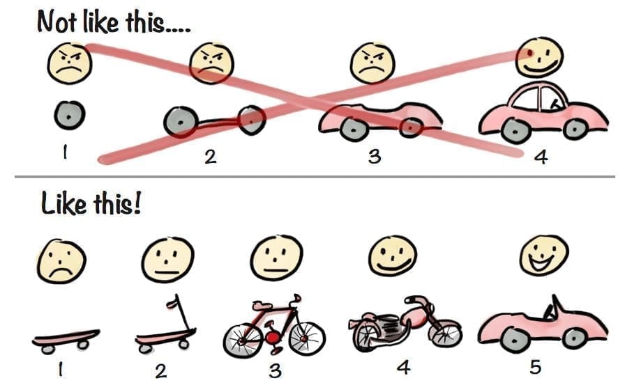
Launch is never done: Designing a seamless experience is constant and iterative. Shelley Bernstein from the Brooklyn Museum urged us to celebrate ‘failing forward’. Here is an image by Kniberg differentiating between designing for final launch vs. iteration… which process are we applying to international student mobility?
Users have ideas about their own experience: When they speak we need to recognize that authority and listen.
Know the user lifecycle and check-in: Does pre-experience expectation meet outcomes? At the other end, how does the user (student) recall their study experience? The middle stuff is important too.
Get out of the way: Don’t create glitches in the user experience that will undermine your ultimate objective. When issues arise, make them THE priority.
Test: It is impossible to know the user experience as much as the users themselves. Enable constant feedback from users who are in a natural setting.
Context, not content is king: Give the users the information they need, when they need it, and in a format that they can consume given their state of mind, capability, location etc.
What is stopping us?
We don’t see ourselves as user experience designers: We would be hard-pressed to find someone with a design degree or title in our field. However, this identity piece shouldn’t hold us back from including design principles in our work.
Our field of international student mobility is pan-Canadian and multi-stakeholder: At CanUX Peter Merholz described various ways organizations can be shaped to optimize design. None of his models captured the complexity of our international education community and the various actors therein. We are not one team designing the next best Instagram application – and so our approach must reflect our complex reality.
What do we have going for us?
Our users tells us their experience every single day: Trusted international student advisors and education abroad advisors on the front-line listen to and troubleshoot challenges alongside students every day. If a ‘testing’ environment needs to be realistic to provide insight it doesn’t get more real than this.
We are all involved: If we each own our small role in designing chunks of the user experience, and acknowledge the expertise of others in their small pieces, we are more likely to advocate and be heard when we identify a glitch and insist on a fix.
Where to?
Let’s fix the glitches in international student mobility: From pre-experience through to experience memory. How are we as a sector designing a system wherein barriers to study abroad for Canadians are minimized? How are we iterating a visa process that prevents long wait-times for international students?
Let’s go beyond: It’s not just about the ‘fix.’ Creating beautiful and seamless experiences for students is where our competitive edge on the global scene could really take hold.
Let’s collaborate: Since our design project is multi-stakeholder (non-profits, students, education institutions, and governments) we need to share notes on what users are telling us along the way. Take those glitches out of the drawer, dust them off, and demand better. CBIE provides venues for this conversation in-person at our Annual Conference and throughout the year through our Professional Learning Communities.
In summary, I think that we are all responsible for design and have a unique and valuable role to play in what the next iteration of international student mobility looks like for Canada’s education sector. Let’s get to work.
– By Lisa Deacon, Manager, Research and Special Projects, CBIE


Comments are closed.